What you need to know about braille and raised print signage
As we covered in our previous blog post, we set up the very basics of ADA signs and the guidelines for ADA compliance. In this post, we will be discussing the differences between raised print and braille signs. Yes. There are differences!
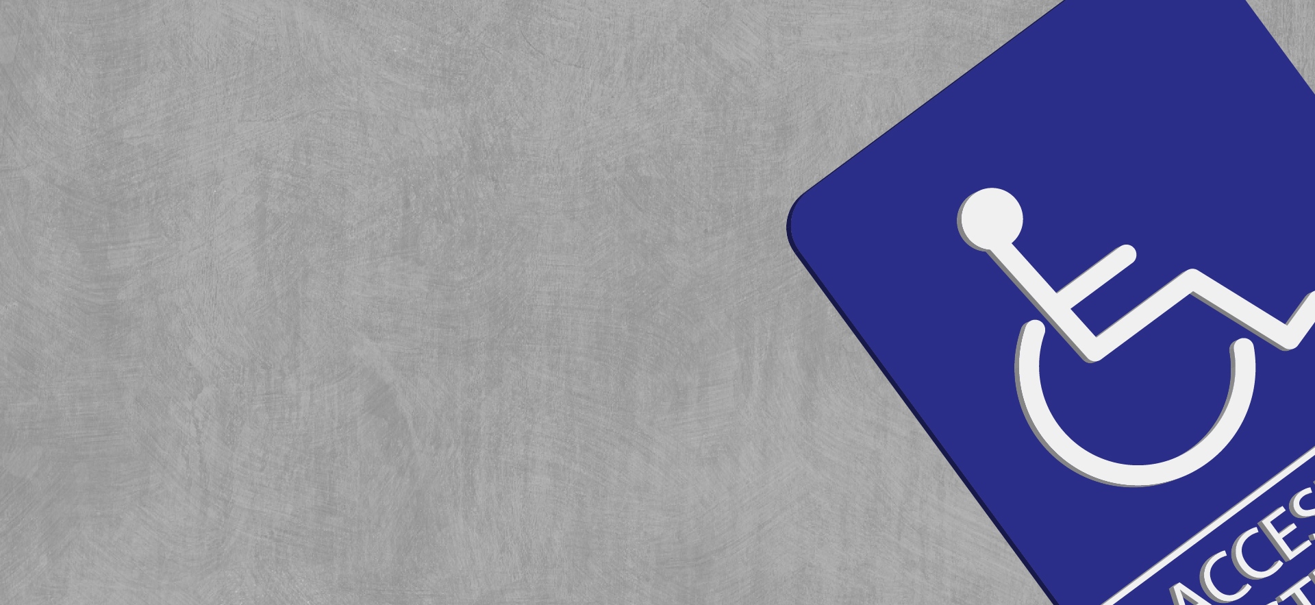
To give a quick rundown of what ADA signs are: these types of signs are used in public and private offices, buildings, libraries, etc. in order to help those who are disabled find their way through these locations. Most signs include grade II Braille, which are raised points for those who are blind. But there are also tactile signs, which are slightly raised areas of these signs (usually where pictograms are located) this is also known as a raised print.
I would like to clarify that both raised print and braille signs do fall under the category of tactile signage.

Raised Print
The interesting thing about raised print is that it isn’t just specific for ADA signs, it can also be put on business cards and other large-format printed materials. The raised print is useful for those who have low to no vision, making it so they can graze their fingers across letters and pictograms in order for them to know where they are. Not everyone can read braille, so these raised signs are a great addition to ADA signage.
One thing to keep in mind when creating custom ADA signs is to make sure that your raised letters are all uppercase, so they are easier to read. It is easier to read all uppercase than a mix of lowercase and upper. Characters on a raised print sign should be about 0.8 – 1.5 millimeters higher than the actual sign itself. You should also make sure the characters are gently rounded, not half-rounded or stylized. The key to ADA signs is making sure they are simple, easy to understand/touch, and are visible to everyone.

Braille Signs
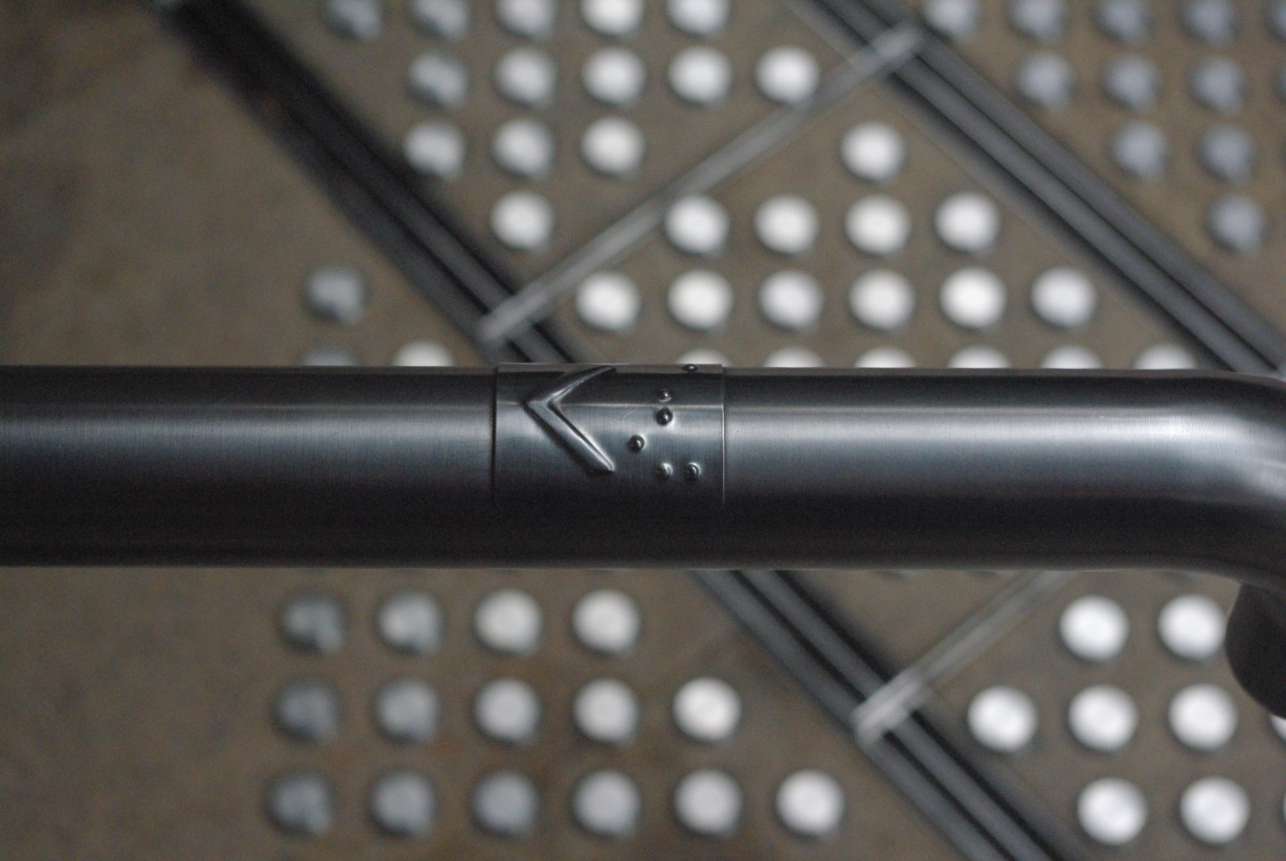
Braille signs follow a similar structure, though the requirements for braille height do differ. These braille signs are essential for accessibility for those who exclusively use braille. Braille dots have a dome shape or rounded shape in each ADA sign.
Braille signs follow a similar structure, though the requirements for braille height do differ. These braille signs are essential for accessibility for those who exclusively use braille. Braille dots have a dome shape or rounded shape in each ADA sign.
The braille should always be located below the corresponding print and separated by at least 10 millimeters. Braille should be used in accordance with UEB (Unified English Braille). This is specifically used in North America. Another thing to consider is when to use an upper-case letter. These include:
- The first word of sentences
- Names and proper nouns
- Indicating individual letters of the alphabet
- Initials or acronyms


0 Comments